
圖層 (實驗性)
可覆疊在基礎觸控配置上方的子觸控配置。圖層目前以實驗形式提供使用,可能會根據早期採用者的意見反應而變更行為。
屬性
具名圖層物件包含下列屬性。center - object、選用。顯示在螢幕中央的控制項轉盤。
left - object、選用。根據預設顯示在玩家左手/拇指下方的控制項轉盤。
lower - object、選用。可讓您將控制項放置在下方控制項列中 leftCenter、center 或 rightCenter 三個位置中任一位置的物件。
right - object、選用。根據預設顯示在玩家右手/拇指下方的控制項轉盤。
upper - object、選用。可讓您將控制項陣列放置在上方控制項列中 right 位置的物件。
備註
使用layer 時,在一般配置中會使用 control 的每個位置 (center、left、lower、right、upper 位置),您可以加入控制項來取代先前顯示的內容,或使用 blank 控制項來隱藏該位置先前顯示的內容。
若要顯示 layer,您必須有一個具有圖層動作的 button 控制項,以使配置顯示。
範例
此範例從簡單的平台遊戲配置開始,右上角有一個按鈕,可切換顯示具有進階能力的圖層。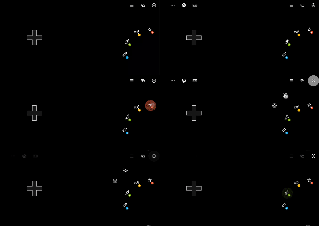
{
    "$schema": "https://raw.githubusercontent.com/microsoft/xbox-game-streaming-tools/main/touch-adaptation-kit/schemas/layout/v3.1/layout.json",
    "content": {
        "left": {
            "inner": [
                {
                    "type": "directionalPad",
                    "scale": 1.5
                }
            ]
        },
        "right": {
            "inner": [
                {
                    "type": "button",
                    "action": "gamepadY",
                    "styles": {
                        "default": {
                            "faceImage": {
                                "type": "icon",
                                "value": "dash"
                            }
                        }
                    }
                },
                {
                    "type": "button",
                    "action": "gamepadA",
                    "styles": {
                        "default": {
                            "faceImage": {
                                "type": "icon",
                                "value": "jump"
                            }
                        }
                    }
                }
            ],
            "outer": [
                null,
                {
                    "type": "button",
                    "action": "gamepadB",
                    "styles": {
                        "default": {
                            "faceImage": {
                                "type": "icon",
                                "value": "specialAbility"
                            }
                        }
                    }
                },
                null,
                null,
                {
                    "type": "button",
                    "action": "gamepadX",
                    "styles": {
                        "default": {
                            "faceImage": {
                                "type": "icon",
                                "value": "fire"
                            }
                        }
                    }
                }
            ]
        },
        "upper": {
            "right": [
                {
                    "type": "button",
                    "action": {
                        "type": "layer",
                        "target": "selectAbility"
                    },
                    "styles": {
                        "default": {
                            "faceImage": {
                                "type": "icon",
                                "value": "add"
                            }
                        }
                    },
                    "toggle" : true
                },
                {
                    "type": "button",
                    "action": "view"
                },
                {
                    "type": "button",
                    "action": "menu"
                }
            ]
        },
        "layers": {
            "selectAbility": {
                "right": {
                    "outer": [
                        null,
                        null,
                        null,
                        null,
                        null,
                        null,
                        {
                            "type": "button",
                            "action": "rightBumper",
                            "styles": {
                                "default": {
                                    "faceImage": {
                                        "type": "icon",
                                        "value": "ability2"
                                    }
                                }
                            }
                        },
                        {
                            "type": "button",
                            "action": "leftBumper",
                            "styles": {
                                "default": {
                                    "faceImage": {
                                        "type": "icon",
                                        "value": "ability"
                                    }
                                }
                            }
                        }
                    ]
                }
            }
        }
    }
}
另請參閱
觸控調整套件參考空白控制項
圖層動作
配置