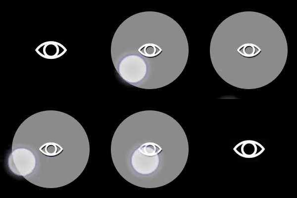
Touchpad
Analog control that enables the player to interact similar to a laptop touchpad.Properties
type - “touchpad”
axis - object or array. A single axis or array of axes that describe the mapping of this touchpad control.
action - object, optional. An action to invoked on touch in addition to the axis mapping.
renderAsButton - boolean, optional. Default to false. Set to true to render the touchpad visually as a button.
enabled - boolean, optional. Defaults to true. Sets the visual state of the control to enabled/disabled. A disabled control will still receive input from the player, but NOT change the visual style based on the input.
visible - boolean, optional. Defaults to true. Determines whether the control is displayed to the player to interact with. To change during game play see Changing touch layouts using game state.
styles - object, optional. Customization of the visual representation of the control. The styles are represented as an object per state that can be styled.
The button control can have the following states styled:
default- The base style.disabled- The style when the control is disabled. If not specified, then when the control is disabled, a transformation will be applied to the default style to make it appear disabled.idle- Applied when the player is NOT interacting with the control.moving- Applied when the when the player is touching the control and noactionis defined.activated- Applied when the when the player is touching the control and anactionis defined.
opacity - number, optional. The opacity to be applied to the control. Default to 1.0 for all states but disabled.
background - object, optional. Can either be a color or image asset.
faceImage - object, optional. Can either be an icon or image asset.
Asset dimensions
For each of the style objects that accept image assets, a given asset is provided at a base resolution and at 1.5x, 2.0x, 3.0x, and 4.0x scales of that base resolution. The resolution of a given image must be less or equal to the following maximum resolutions:
Remarks
Thetouchpad is best used for non-sticky, no-deadzone output — typically the look camera in a first/third-person perspective game.
For games that support mouse input, the touchpad can be used with relative mouse to provide a more tuned look camera experience.
Styling remarks
When renderAsButton is true:
- When in the
activatedstate, thefaceImageis displayed 25% smaller. - There are labels and default styling for the background color for buttons that do not use custom assets and have a single action of
gamepadX,gamepadY,gamepadA, orgamepadB.
Samples
Example 1: Touchpad with a look icon
Figure 1. Touchpad Control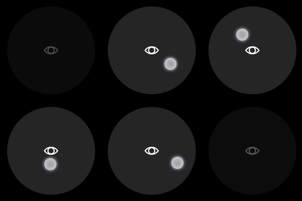
Example 2: Touchpad with a look icon that is rendered as a button
Figure 1. Button Touchpad Control