
Color Palette
A collection of reusable colors that can be referenced in layouts.Properties
default - object, optional. A collection of Hexadecimal color definitions that can be referenced using a color reference.
highContrast - object, optional. A collection of Hexadecimal color definitions that can be referenced using a color reference. Overrides definitions in default when High contrast mode is enabled.
Sample
Remarks
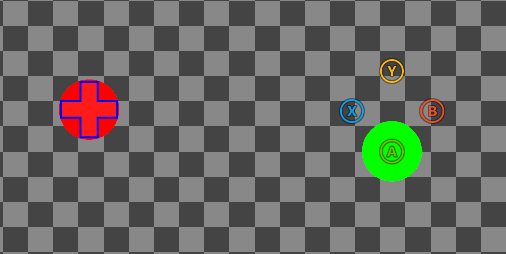
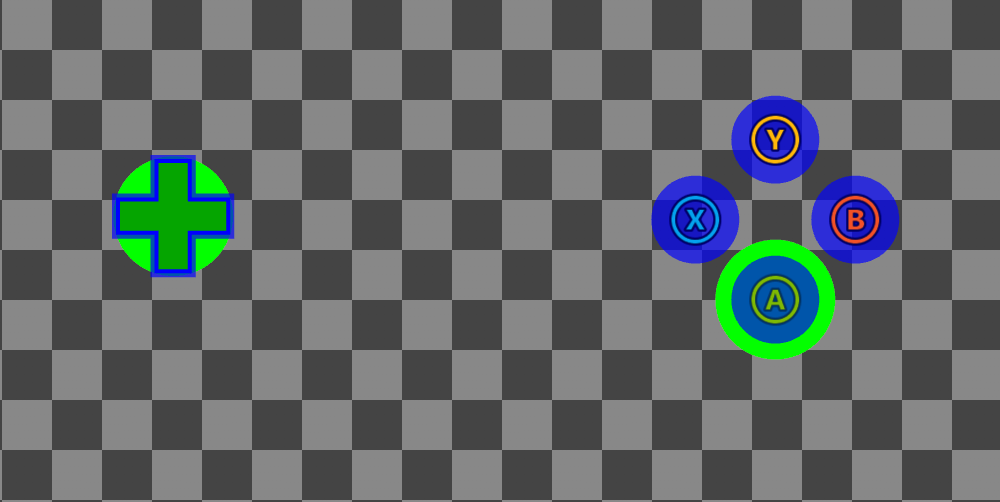
The above sample includes color definitions that override system colors (e.g.,system_contentPrimary, system_accentPrimary etc.) as well as custom color definitions (myColor1, myColor2). Controls implicitly sample system colors when styling, meaning any overrides will effect the global styling of all controls (unless a control has it’s own override within a custom styles block). Custom colors must be explicitly referenced using a color reference (e.g., colors/myColor1). Additionally, custom color definitions cannot use the reserved system_ prefix as it’s reserved for system colors.
Color definitions are declared in default and highContrast objects, and are activated when high contrast mode is disabled or enabled, respectively. When high contrast mode is disabled, colors are sampled from default. When enabled, colors are first sampled from highContrast, falling back on default if no definition exists. If a system color override is not present in default, a system default is used, while custom colors must be defined in default. The following table outlines how the above color definitions will resolve dependent on if high contrast (HC) mode is enabled or not:
System colors
The following table summarizes the list of system colors in the touch adaptation kit, a description of how they are used to style controls, as well as their system default values when high contrast (HC) mode is disabled/enabled.
For an up to date listing, refer to the definitions prefixed with
_SystemColor in the latest schema.
See Also
Touch Adaptation Kit ReferenceHigh contrast mode for Touch Adaptation Layouts